One of the challenges faced for any organisation is how to convey their purpose statement. As leaders we may be asked at any time to communicate the purpose of our company or our team – whether we’re in an elevator and run into a colleague, out at a pitch, or creating written material such as a grant application.
We may be able to do this in the form of a mission or vision statement. Beyond this, to create meaning for our teams, we need to be able to connect these overarching statements with specific activities and outcomes.
In all of these circumstances, it’s very helpful to have rapid access to a framework that quickly allows us to summarise our purpose. This framework can be something we picture in our mind, or something more concrete, such as a written document we can hand to people.
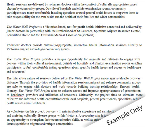
As a small case study, just last week I was helping The Water Well Project to express their purpose statement. The Water Well Project is a non-profit organisation established by voluntary doctors to provide informal health education sessions to refugees. The Project was in the process of submitting an application for a grant. In the write-up for the application, the group expressed it’s purpose in paragraph format, like the example below.

I suggested it would be simpler for the organisation and their readers to ‘show’ the purpose statement in the form of a framework. Together with the group we created this visual representation of their statement of purpose:

Download this Purpose Statement example (PDF)
Which one do you prefer? The written statement, or the illustrative figure?
Creating your own framework
Simple frameworks like this one help the mind cluster information into appropriate categories. Through this clustering we’re able, at a glance, to develop a strong representative picture of the organisation. Here are 4 easy steps to creating your own visual statement of purpose for your company or team:
1. Cluster the information into groups
The first step is to break down the information you wish to present into groups. In the example attached, we wanted to convey ‘how’ the project did things, and the ‘outcomes’ it delivered. The information we wished to present fell naturally into three groups (mission, how, and outcomes), which gave us a strong structure to work from.
2. Look for a flow of the story
There’s always a flow to the information we wish to present. In this example, we wanted to show the ’cause and effect’ relationship of our activities to outcomes. So, we structured the slide from left to right, so any member of the organisation could explain the connection between what the organisation does, and the benefits these activities provide to members of the community.
3. Have no more than 5 sub-points per group
As a general rule, it is difficult for people to remember more than 5 sub-points for any particular theme. When considering outcomes for stakeholders, The Water Well Project provides value to volunteer doctors, refugees and recently settled migrants, and the heathcare system. Rather than listing all of these benefits in one long list (which would have been far more than 5 sub-points), we broke down these points into the three stakeholder headings. As well as making the information easier to read, this clearly explains the purpose of the organisation to its three target stakeholder groups.
4. Use headings, then descriptions
Headings help readers take in information at a glance. Often, instead of headings, we’re tempted to just write a paragraph of text. However, it is simple to add a brief heading, then add context to this heading with a short paragraph. Structuring information like this will provide your framework with multiple points of entry for the reader, whether they have 30 seconds or 5 minutes.


